Site Name
Smart Supermarket
This name was selected because it clearly communicates the purpose of the website - helping users make smart shopping decisions by comparing supermarket prices. The name is memorable, descriptive, and immediately tells visitors what to expect from the site.
Site Purpose
The Smart Supermarket website serves as a comprehensive price comparison tool that:
- Allows users to compare product prices across different supermarkets in Ecuador
- Helps consumers make informed purchasing decisions
- Provides historical price data to track trends
- Enables users to filter and sort products by category and price
- Offers a platform for users to suggest new products for comparison
Scenarios
- As a budget-conscious shopper, I want to know which supermarket has the best prices for my weekly grocery list so I can save money on my shopping.
- As a frequent shopper, I want to track price trends over time so I can identify the best time to buy certain products.
- As a busy parent, I want to quickly compare prices of essential items across different supermarkets so I can plan my shopping efficiently.
Color Schema
Forest Green
#2E7D32
#2E7D32
Amber
#FFA000
#FFA000
Blue
#1565C0
#1565C0
Color Usage:
- Forest Green: Primary color for headers, navigation, and important buttons
- Amber: Secondary color for call-to-action buttons and highlights
- Blue: Accent color for links and interactive elements
Typography
Font Selection:
- Poppins: Used for headings (h1, h2, h3) - Clean and modern sans-serif font that provides good readability and hierarchy
- Roboto: Used for body text and general content - Highly legible font that works well across different screen sizes
Wireframe
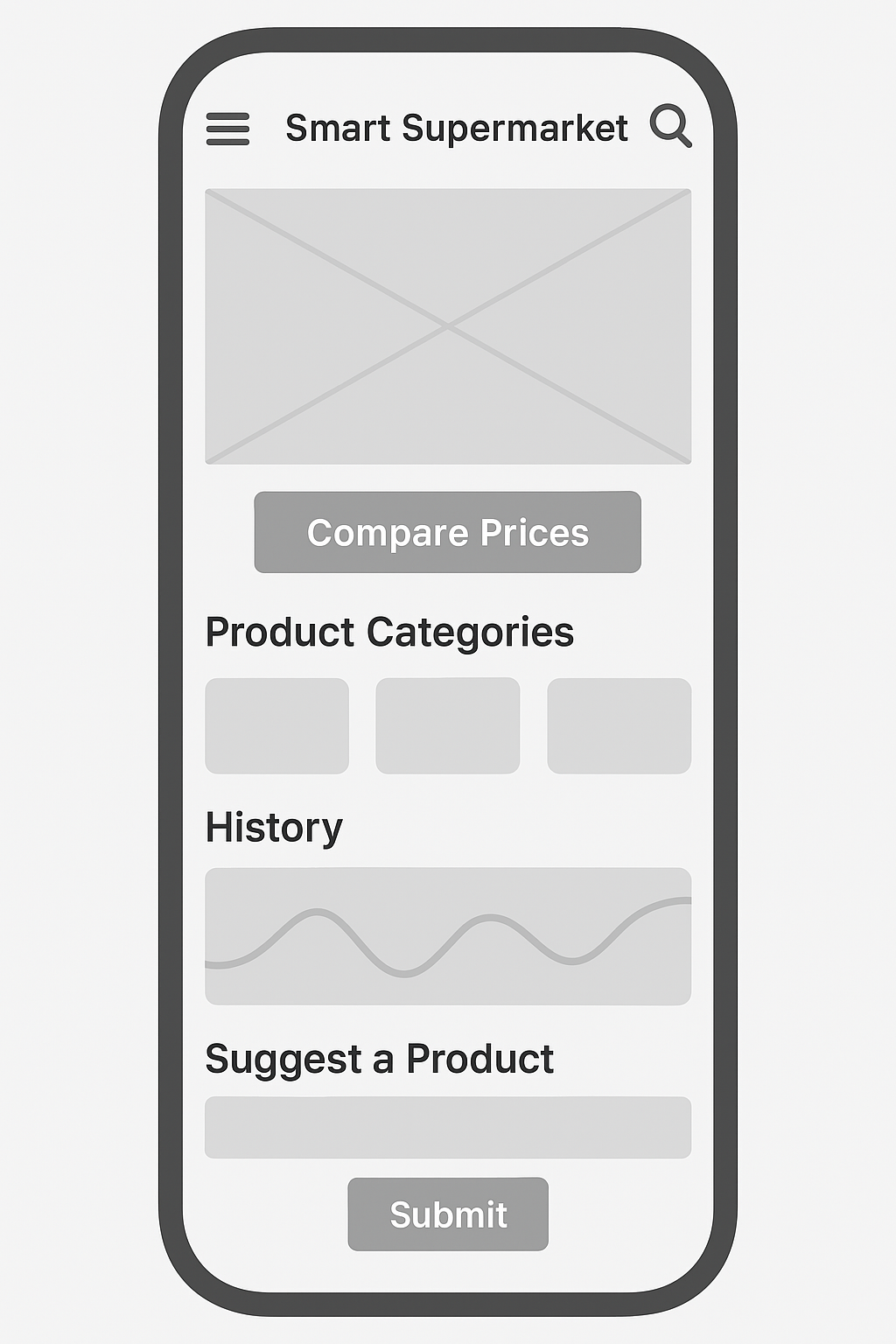
Mobile View

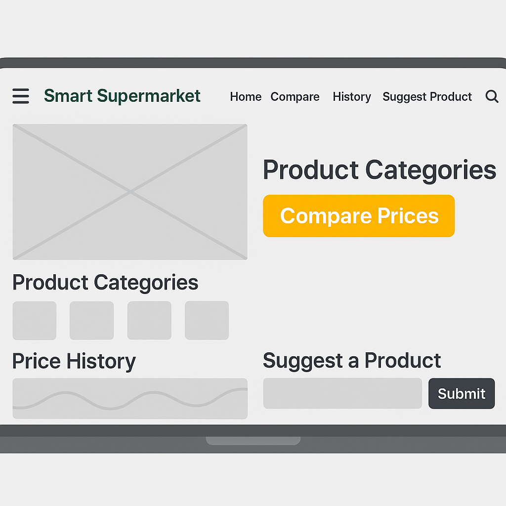
Desktop View
